


·Adding Parameters to the Histogram
·Setting up a Histogram as a Mixture Map
The histogram provides a visual indication of the amount of time spent in at specific value within a parameter. A colour dimension can be added to the histogram to display a second dimension of information.
The following screen shot shows a typical application as a mixture graph:

Histogram as a mixture graph
This graph has MAP (manifold pressure) on the x-axis, the overall height of each bar represents the proportion of time MAP was within the width of the bar. Each bar is coloured representing the air to fuel ratio (wideband), the proportion of each colour inside the bar represents the amount of time the air fuel ratio was inside the specified range while MAP was within the width of the bar.
You can see from the above graph that at high MAP levels, the proportion of green/pink/blue colours is much larger than at low manifold pressure. At low MAP there is a much higher presence of red colours representing an air to fuel ratio of greater than 14. This provides a quick method of determining the most common air to fuel ratio at any given MAP. If you were seeing red colours at high MAP levels then it would indicate a potential problem.
To create a Histogram:
·Click Logging > Histogram in the menu or
·Right Click in open space > Select New View > Select Histogram
Use the Y Parameter setup to configure the Y Axis on the plot,
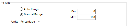
The following setup options are available:
·Auto Range - Automatically sets the displayed range of the Y axis.
·Manual Range - Allows the user to set the displayed range of the Y axis.
·Min - Enter a minimum value for the Y axis.
·Max - Enter a maximum value for the Y axis.
·Units - Sets whether the Y Axis is scaled by % of time or number of samples.
Adding Parameters to the Histogram
To add parameters to the view, right click select 'Properties'. The following dialog will appear:

Setup Window
From this window parameters and groups can be added. Parameters can also be removed or edited. Click either 'Add Group' or 'Add Parameter', the following selection form will appear. 'Add Group' isn't available for all Views.

Select Parameter Window
Click or search for the required parameter. Multiple parameters can be selected using the Shift and Ctrl keys, entire categories may be selected. Click OK to add the parameter to the view. Note: When searching or viewing logged parameters, icons indicate whether a parameter has data in the current log file.
Here the user has searched 'eng', the list is displayed alphabetically, and the icons now indicate whether the parameter has data in the current log file.

Select Parameter Window - Search
The user can also search the logged parameters for a specific parameter, here the icons will always be green.

Select Parameter Window - Logged Search
Colour ranges allow views to represent values as colours.

Colour Range Setup Window
A minimum value, a maximum value and a number of colours (divisions) can be manually specified. Alternatively this information can be extracted from the parameter. To do this click the parameter selection box.
To change the colours, double click on each colour, a colour selection window will appear. Choose the appropriate colour.
Colours can be automatically blended in a smooth fashion, to do this highlight more than two colours. Click 'Interpolate Selected', a smooth gradient of colours will be created between the top and bottom colours.
Each colour range can be loaded and saved to a file. This is done using the 'Save to File' and 'Load to File' buttons.
To change the display properties of the Histogram, right click and select 'Properties'. In the Properties window you will notice a 'Display' tab. Click on this to see the range of available display properties.

Display Options Setup
The following options exist:
·View
·Caption - Enter a caption to be used for the Histogram.
·Linkage
·Common Time Range - Enables and disables the view from sharing a common time range and zoom with other views.
·Layout
·Tiled - The time plot will show a separate plot area for each group.
·Overlapped - All parameters will share one plot area.
·Columns - Specify the numbers of columns that Histogram will display in when multiple parameters are setup. Only available in Tiled view, and if Auto Columns is un-ticked.
·Auto Columns - Columns will automatically arrange into a suitable formation if using multiple Histogram Plots. Only available in Tiled view.
Using Histogram as a Mixture Map
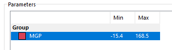
To use the Histogram as a mixture map you first need to add parameters to the plot. A mixture graph requires MGP on the x-axis and Lambda/AFR on the colour scale.
1.Open the histogram plot properties, do this by right clicking anywhere on the plot and selecting Properties. Make sure the Parameters tab is currently visible.
2.Set the mode to Auto Range and set the units to Percentage.
3.Next you will need to add the x-axis parameter, to do this click the Add Parameter button at the bottom of the dialog. A list will appear, select MGP (Manifold Gauge Pressure).
4.MGP will now be added to the list of x parameters.
Hint: You can add more parameters to this list if you require. This is typically used for analysis of multiple channels of the same type of measurement
5.The colour parameter now needs to be setup. Select the Colour Parameter tab.
6.Check the box 'Use Colour Parameter' to enable this function.
7.Click the icon on the right of the Parameter box. A list will appear, select the appropriate 'Lambda' channel.
8.You will now need to setup the colour range. Set the minimum, maximum and number of colour increments (divisions) that you want the plot to display. Typical numbers for AFR could be a minimum of 9, a maximum of 16 with 7 divisions. As you choose these numbers, the colour range will be generated using a green colour for the minimum and a red colour for the maximum. The regions in between will be filled with a smooth blend through yellow.
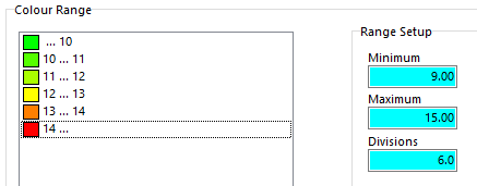
Hint: See the section on Configuring Colour Ranges for more advanced control over the colour range.
9.Display properties of the Histogram Plot can be configured. Click the Display tab.
10.Set the caption to something appropriate. E.g. "Mixture Graph".
11.Check the 'Common Time Range' check box for the Histogram Plot to only display samples over the time range controlled by a Navigator view.
12.The layout options apply when there are multiple X parameters displayed. Overlapped means all of the parameters share a common surface, tiled means that each parameter gets its own surface. When in tiled mode, columns can either be automatically calculated or manually set.
13.Click OK to complete the setup.